Styling and Branding
ClickHelp offers extensive functionality to help you customize both the portal appearance and content styles. This documentation section outlines everything related to customizing content and portal look and feel — from styling topic content to setting up a custom 404 page or a custom domain name.
In ClickHelp, content styles and interface styles are separated, so changing content styles doesn't interfere with the interface styles and vice versa. They are configured separately and in different ways. Hence, it's essential to distinguish two key concepts — styling and branding.
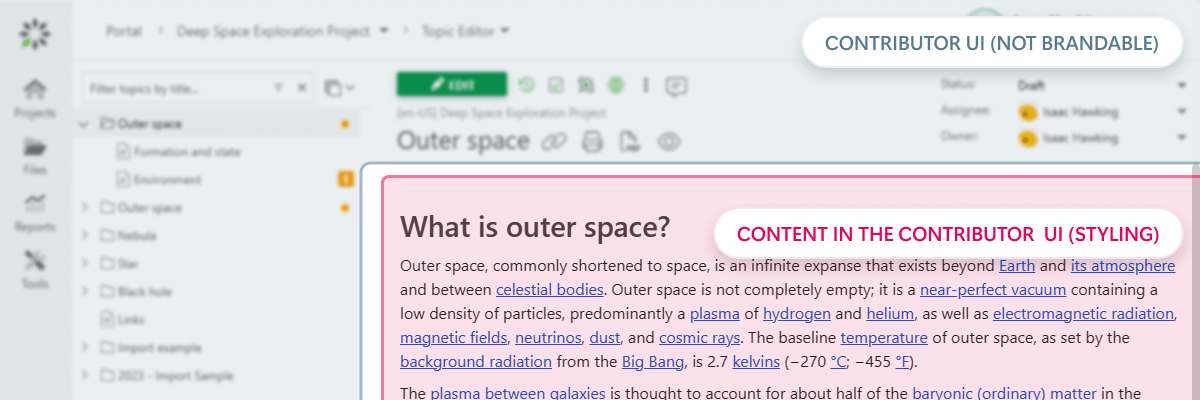
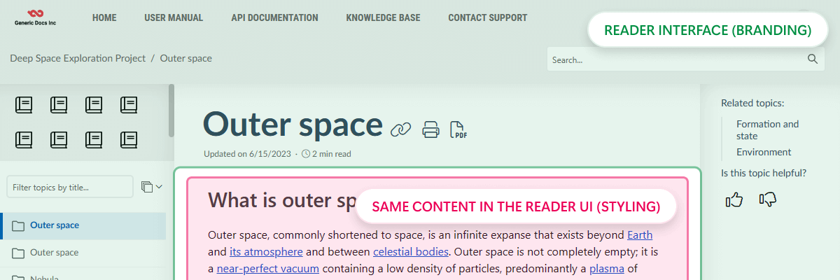
Let's first look at how both the Contributor and Reader interfaces look and which parts can be styled or branded.
| Contributor interface |

|
|
Reader interface
|

|
Styling
When it comes to styling in ClickHelp, we imply shaping the look and feel of your content — what you, as an author, write. Styling affects the building blocks of your documentation — headings, tables, images, lists, and so on — and helps make them look consistent, adhering to a style guide.
Since the topics' content in ClickHelp is HTML under the hood, all styling is done via CSS. You can apply it in two ways:
-
Visually, in the Topic Editor's design mode, by selecting different options like font size or text color on the ribbon. Doing so will create inline styles and apply them to a particular element only, not all elements of this kind throughout your documentation.
For example, applying a larger font size and changing the color of a particular second-level heading from the ribbon will change the style for the single selected heading only and will not change any other second-level headings in this topic or other topics of your project. - By writing rules in a separate CSS file that's attached to a project. You can find the default Style.css in the project's Basic Settings.
Using the style files is a preferred way of styling your content, enabling you to configure styles in a centralized manner. This way, you can save lots of time and effort compared to manually setting/fixing styles for each element.
When you create or import a project, the system creates a default style file — Style.css. When creating a project, the Style.css default content depends on the Project Template you select — it gets populated with predefined CSS rules for tables, Quick Parts, Navigation elements, and so on.
| By default, each project has its own Style.css file. Although using a shared Style.css file is also possible. |
Since publications get their copy of all style files during publishing so that changes to a project do not affect live content, you need to update publications to see styling changes. On the other hand, changes made to style files are immediately reflected within the project — you may need to refresh the page, though.
Branding
Unlike styling, branding has nothing to do with how your content looks; instead, it affects what your readers see besides the content — the Reader Interface (UI) — the search bar, your company logo and colors, the common header and footer, the Reader Interface layout and so on.
The portal branding is mostly configured on the Reader Interface Settings page, where you can choose a Reader UI template, define the standard header and footer, set up colors, etc.
| Since projects can override portal settings — Reader Interface settings included — each project can have its own unique Reader UI Template. |
Additionally, you can utilize the Branding.css and Branding.js files to fine-tune the appearance and behavior of Reader UI elements. These styles and scripts will determine the look and behavior of the interface elements, not the content.
Since these changes change the Reader UI, you won't see them in the Contributor UI and will need to open a publication as a reader.
The only page with a different styling workflow is the Home Page. It has its own styles that you can configure in the Home Page styles editor on the Portal Home Page settings page.
The WYSIWYG Home page editor mentioned here has been deprecated since the Amber release (Autumn, 2023) and is subject to removal in future releases. Please consider using the new block editor instead. |
Dive into the section further to read about portal look customization and content styling in more detail:
- Topic Content Styling
- Branding: General Information
- Documentation Portal Home Page
- Reader Menu Editor
- Branding & Styling FAQ