Things You Absolutely Need to Know to Create a Help Center
 Elmirain Technical Writing on 7/20/2022 — 6 minute read
 Elmirain Technical Writing on 7/20/2022 — 6 minute read

A help center has become an essential element of any website. Without a help page, your customer service will be flooded with complaints and requests, often similar or even identical. To avoid this, product developers and technical writers should think of creating an efficient help center at the initial stage of content creation.
A help center is a part of the content usability concept. Putting it simply, a help system is focused on making it easier for customers to use the content on your site (information about a product or service). The ultimate goal is to improve user experience (UX) by providing simple and clear answers to recurring questions. The latter may be strikingly simple ones, like:
I cannot find the RELOAD button. Where is it?
or:
How do I mute the music? Is there a muting option?
More complex questions may look like the following:
How can I change my subscription plan? Is it possible to make changes before the current subscription is expired? Will the unexpended funds be accounted for the new subscription, or do I have to pay the full price?
Of course, most things are intuitively comprehensible. However, users often get stuck at the first step, like in the case above, when the user cannot see the Reload button on the dashboard.
The paradox is that even if you make the Reload button three inches high, there will still be users who won’t be able to find it. For them (and many others with more complex problems), you have to create a help center page.
The content of the help page may vary. The most common elements are an FAQ (frequently asked questions) page, a knowledge base (it can be called a learning center as well), and a Contacts page. The latter can contain just an e-mail address and a phone number. It can also come with a question form which has to be filled in by the customer.
The main function of a help page is ‘to relieve pressure’ from customers. Support specialists often call it case deflection, which means ‘deflecting’ or diverting a large amount of repeated or identical questions. As a result, it saves time for the customer support team. Users just get the right answers on the FAQ page, from the pop-up explanations, or from the articles in the knowledge base. The availability of such ready-made solutions satisfies a lot of users.
As the customers don’t write (or write less) to the support team, this increases the ease and speed with which they can use the product. This means enhanced product usability, better UX, and better feedback from customers. And this leads to better marketability of the product and higher sales.

A customer portal can be ‘assembled’ from different elements and have different parameters, but the core requirements are the following:
To sum it up, developers and technical writers should try and look at the product with the users’ eyes. This will help to create the best help center ever.
ClickHelp offers a possibility to create your own portal in a quick and easy manner.
ClickHelp has other features that can make the life of the user easier. All of them are aimed at providing the user with the needed information. Take context-sensitive help (or CSH), for example. It is designed for people who start to work immediately and solve problems as they occur. At the same time, such users get frustrated easily (just as fast as they work) and switch to products with intuitive solutions. You can say CSH is an alternative solution to a portal. And the good news is you can create it in ClickHelp.
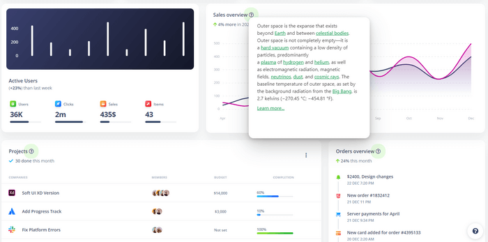
ClickHelp offers CSH that makes it possible to get the information online in real time. ClickHelp generates code for Context Help items. Such content is usually not available as a single technical document. Only pieces of a technical document are used to describe specific application states. These ‘pieces’ already exist in the form of separate help topics. So when updating these topics in the portal, they are updated in CSH as well. Here’s an example from a sample page that demonstrates Context Help features of ClickHelp:

Unlike a standard help topic, a context popup has to give a precise and direct answer to a user’s question or concern. So the information popups contain should be concise, and the message should be clear from the context in which the user will find it in the UI.
A help center is an important addition to your website. It produces a good impression on your readers, users, and customers. It saves time for both sides of the product support process: the users and the support team. It enhances the marketability of your product and, ultimately, boosts sales.
Good luck with your technical writing!
ClickHelp Team
Author, host and deliver documentation across platforms and devices
Get monthly digest on technical writing, UX and web design, overviews of useful free resources and much more.
"*" indicates required fields