
Fonts are an important part of any documentation design be that API documentation, user manuals, case deflection or something else. That is basically the body of the written text. Choosing a font directly influences text perception by readers: its readability and accessibility. Which, in its term, can change the learning curve and product adoption.
In this post, we will cover what you should pay attention to when playing around with fonts and their properties.
Using Color With Fonts
The easiest thing one can do is to write black letters on a white background. And, generally speaking, there’s nothing wrong with that. However, if you want your docs to be more visually appealing and look professional, you might want to alternate the shades a little. Also, black is often replaced with dark grey to make the contrast softer – it is less tiring to read.
Using paler shades of the same color is something we often see with titles – this way it becomes easier to grasp the title hierarchy. While implementing this approach, don’t forget about readability. Otherwise, it defeats the purpose.
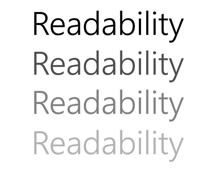
We all might perceive colors a bit differently, this is an important thing to remember when using contrast in technical documentation.
On the one hand, contrast is vital for a readable text, on the other – overdo it just a tiny bit and it will make your readers’ eyes hurt.

As far as the color schemes are concerned, there’s no need to reinvent the wheel. Great color schemes/tools to generate them are available all over the Internet. Just checking Google’s material design guide can alone do a lot of good!
Choosing Fonts
Serifs Are Coming?
Although sans-serifs are undeniably the most commonly used fonts on the Internet, there are certain trends in 2020 that are bringing back serifs.
It is mostly connected to their strong story-telling characteristics. But, we believe that technical writing is going to stick to sans-serifs for now despite this. Why? Well, there were several reasons sans-serifs were chosen to represent the modern era of UI. One of the reasons is that these basic shapes are extremely readable and look great even on small screens.
Sans-serifs are clean and crispy. And that works like a charm for user manuals – less stress for readers through higher readability.
At the moment, your safest go-to options are Proxima Nova, Roboto, Open Sans, and other popular sans-serif fonts. Let’s leave the storytelling to marketing for now and wait and see – perhaps the trend to humanize technical documentation will change things around.
Recipe for Perfect Font Combination
It is interesting how our brain chooses what it likes. More often than not, it likes what it is accustomed to. Talking about fonts, understandably, a technical writer would be at a loss trying to figure out which font combinations are better perceived by readers.
That is why most tech writers would just go with what their help authoring tool has by default, their company style guide offers, or just pick one safe font and that’s it. Having a style guide is the best-case scenario while the other approaches we mentioned are not so flawless.
With that said, here’s something to help you out with combining fonts: Font Coordination: How to Avoid Using the Wrong Fonts on Your Website. There you’ll find a nice little reference table that can save you a lot of trouble.

Rules of Font Selection for Technical Documents
There are certain essentials and rules concerning fonts that should be observed in a document:
- Your headlines should be from NON-SERIF fonts (like Arial, Tahoma, Verdana) and your body text from SERIF fonts (like Times New Roman, Georgia, Bookman).
- Do not overburden your document with different fonts. An abundance of typefaces leads to confusion in the reader’s mind. Use two or a maximum of three typefaces.
- Seek to use the most famous fonts. Not all computers have access to every font you have. However, all computers have a set of built-in fonts. The most famous system fonts are Arial, Times Roman, and Courier.
- Be careful with accentuations. The purpose of Italic is to attract attention by being hard to read. It makes sense to emphasize a word or a phrase by using Italic. Though, if your whole page is in italics, it will defy the entire purpose of the Italic style.
- Numerals or figures should be distinct from letters. For example, to clarify the digit one. The distinction between the capital letter O and digit zero 0 should be distinct, whether through a slash, the narrowness of the zero, or another indicator.
- Effective font size should be big enough to read easily but doesn’t take up too much space. The reliable choice for text is a 12-point font, usually since it’s widespread in the business world. On the other hand, headings should be larger than a 12-point font to separate them from the text. Increasing the heading size to a 14-point or 16-point font is enough to make your heading stand out.
Conclusion
In our day and age, it is only natural for techcomm to be more than writing. Technical writers require basic knowledge in many fields (for example, in marketing). We hope that this overview of how to work with fonts will help you understand web design better to create more readable user manuals!
Good luck with your technical writing!
ClickHelp Team
Author, host and deliver documentation across platforms and devices