In today’s digital age, product documentation has become an essential component of a successful business. However, it’s not just about having clear and concise documentation for your customers. It’s also about creating a seamless experience for them when accessing this information. That’s where branding comes into play.
In this article, we will explore the importance of branding for documentation portals and how it can enhance the user experience. We will also provide expert insights and tips on creating a cohesive and professional look for your product documentation. Whether you’re a business owner, a developer, or a writer, this article will help you understand the significance of branding for documentation and how to implement it effectively.
What Is Technical Documentation Branding and Why Is It Important?
Branding is necessary so that the documentation portal visually corresponds to your website and brand. That is, everything should be consistent — not in such a way that your website has one appearance and the documentation portal has another. Having different designs looks unprofessional.
The main reason for branding is to bring the documentation portal in line with your own style. If there is no branding for the documentation portal, it may seem strange to readers that when they open the product documentation, they end up on a website that looks different. In this case, the reader may be unsure if they have even landed in the right place. Perhaps some other website has opened up.

How to Create Stunning Branding?
Whether you’re a startup or a well-established company, these steps will help you elevate your documentation to the next level and strengthen your brand identity.
Step 1. Transfer the Logo and Configure Corporate Colors
The logo is the most noticeable element on the page. Even if all the documentation is not in branded colors, with the logo, the reader will immediately understand that they are on the right page.
Every company has an accent color or several that convey the company’s identity. If a user lands on green documentation from a green website, everything becomes clear right away. If you land on black documentation from an orange website, the reader may get confused.
Step 2. Transfer the Website Style to the Documentation Portal
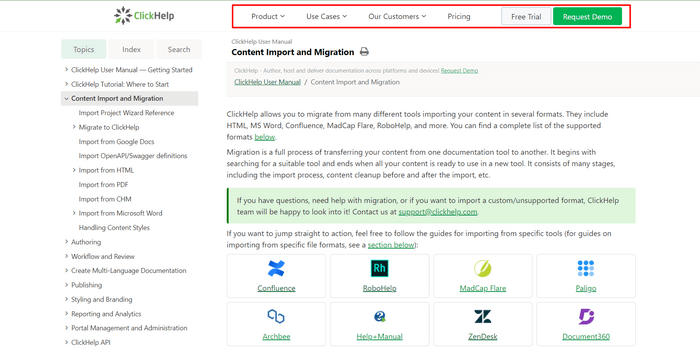
You can make the documentation header identical to the company’s website. For instance, ClickHelp — a platform for technical writers — has the same top menu with elements such as Product, Use Cases, etc. on both their main website and documentation portal.

Step 3. Add What End-Users Are Missing
The final step is to meet the expectations of end-users. For example, users may not like the rounded corners of the elements — even such small details need to be taken into account when branding.
In theory, this rule applies to any design — you should always ask the target audience if they like everything. Since any design is created to solve practical tasks, relying solely on your own taste can be reckless.
Documentation Portal Branding With ClickHelp
As we mentioned above, ClickHelp is a help authoring tool. This platform offers several features that can help you with branding your documentation portal. Here are some of them:
- Customizable templates. ClickHelp provides a wide range of customizable themes that can be used to match the branding of your company. You can modify the color scheme, typography, and other design elements to create a consistent look and feel for your documentation.
- Custom CSS. With ClickHelp, you can also add custom CSS to your documentation portal to further customize the look and feel of the site.
- Logo and favicon. ClickHelp allows you to add your company’s logo to the header of your documentation portal. You can also add a favicon to the browser tab for a more professional look.
- Branding for exported documents. ClickHelp provides the ability to brand exported documents with your company’s logo and colors.
By using these tools and features, you can create a consistent brand identity across all of your company’s documentation, ensuring that your customers have a seamless experience when using your products or services.
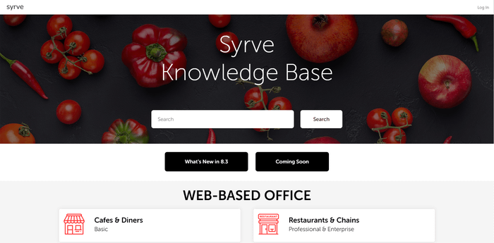
Let’s take a look at some examples of documentation portals that were created in ClickHelp. First, consider Syrve — comprehensive POS and Restaurant Management Software.

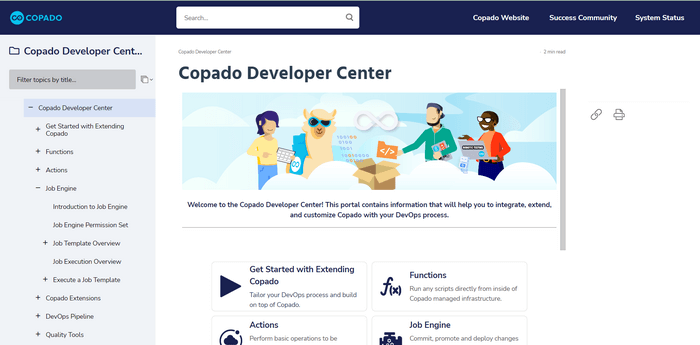
Second, Copado — a DevOps and testing solution designed for low-code SaaS platforms. Their documentation portal boasts a stunning Reader UI complete with a search bar integrated into the menu, corporate colors, and a well-defined table of contents.

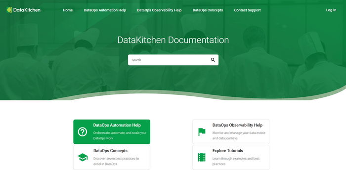
Third, DataKitchen — a cloud-based DataOps platform that helps organizations automate the development and production workflows and facilitate collaboration among cross-functional teams.

As you can see, with ClickHelp, you can brand your documentation portal as you wish. Moreover, our team will provide you with branding services if you need help.
Conclusion
Branding for documentation portals is crucial for businesses that want to create a professional and cohesive look for their product documentation. It not only helps to establish trust and credibility with customers, but it also enhances the user experience by providing a seamless transition between the website and the documentation portal.
By following the expert tips provided in this article, businesses can create a consistent design that reflects their brand and style, making it easier for customers to find the information they need. So, whether you’re just starting out or looking to revamp your existing documentation portal, consider the importance of branding and the positive impact it can have on your business.
Good luck with your technical writing!
ClickHelp Team
Author, host and deliver documentation across platforms and devices
