
Monospaced fonts or non-proportional fonts are the ones where any symbol has the same width which is often achieved by adding more empty space before and after a letter or a character. Monospaced fonts always remind us of programming, code, hackers and such.
It is no coincidence these fonts are used in application development IDEs. Technical writers also use these fonts in code examples when writing software documentation. Keep reading to find out why those fonts are used for code writing.
Why Write Code in Monospace?
There are some solid reasons monospaced fonts have a long history with code writing:
- Similar looking characters are easier to distinguish (like 0/O, I/l) in monospaced fonts;
- Symbols like ‘:’, ‘)’, etc. are clearly visible among monospaced letters due to some space added from both sides;
- Line length is the same whatever characters are used – you won’t need to count spaces in your tree-like code structure;
Point 1 should be explained in more detail as it almost single-handedly made monospaced fonts super readable for coding. Most of the monospaced fonts use the so-called slashed zero. It is our usual zero character with a slash right across it. A very convenient feature for differentiating an ‘O’ and a zero.
Monospace is represented by so many fonts now. Which one to choose? Further on, we will give you a glimpse of the most popular monospaced fonts. Perhaps, you’ll find just the right one among them.
Monospaced Fonts
We’ve analyzed the best monospaced fonts for you using the one and only Google Fonts service. To get a clear picture of how often certain mono fonts get downloaded, whether they feature a slashed zero, etc., we gathered all the info into one table. Under the table, you’ll be able to see the fonts themselves, with examples.
| Font Name | Used Over Last Week | Featured in Websites | Slashed Zero |
|---|---|---|---|
| Inconsolata | 339m | 730,000 | Yes |
| Roboto Mono | 201m | 74,000 | Yes |
| Source Code Pro | 90.1m | 200,000 | Yes |
| Droid Sans Mono | 32.4m | 89,000 | No |
| PT Mono | 20.7m | 95,000 | Yes |
| Anonymous Pro | 8.97m | 98,000 | Yes |
Inconsolata
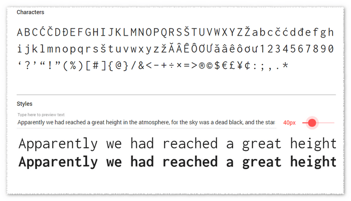
Roboto Mono
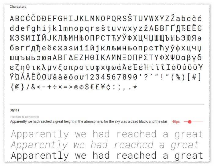
Source Code Pro
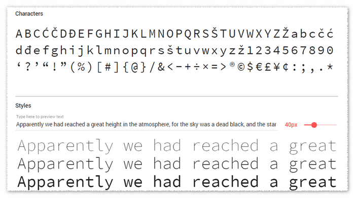
Droid Sans Mono
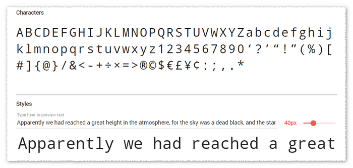
Anonymous Pro
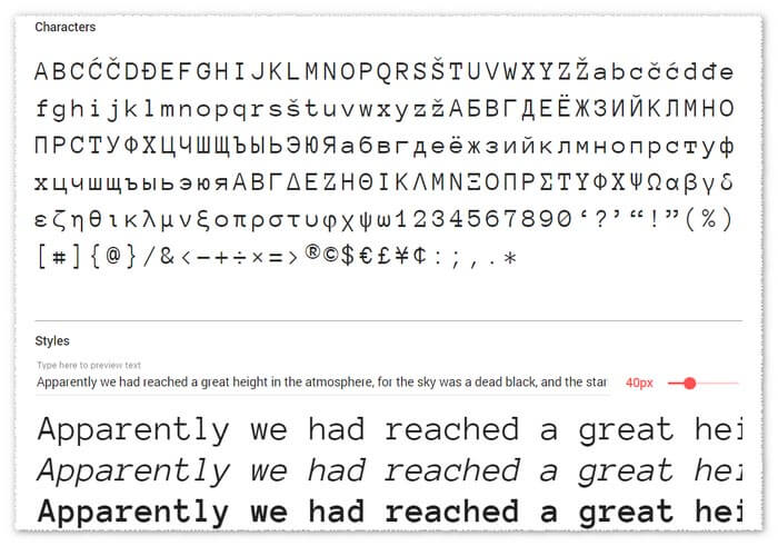
PT Mono
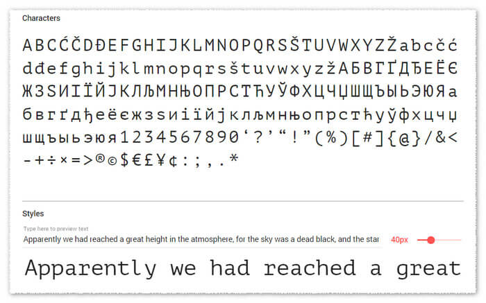
Ligatures in Monospaced Fonts
When talking about monospaced fonts for programming today, one cannot but mention this awesome trend – ligatures.
Ligatures can also be found in proportional fonts for the following characters: fi, ffi, and fl.
And, using ligatures in code would make so much sense. As you know, there are many symbols in programming that consist of several characters (like, && or ==). Such symbol combinations represent a single unit. So, basically, ligatures are additional characters in a programming font that depict these combinations as one.
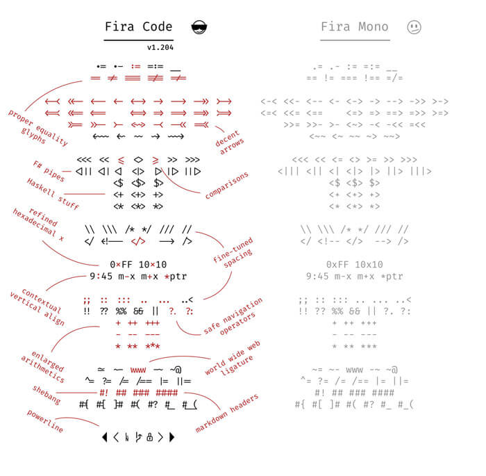
This definitely increases code readability. Ligatures are recognized by our brain easier, so, you can scan through the code faster and, also, ligatures are easy to type.
But, that’s not the only way they can be used. Icons can be added as ligatures. This is yet another great feature to improve navigation within code.
You can give ligatures a try using the Fira Code extension for the Fira Mono font. It adds a set of ligature characters to this font.
There’s a downside we should warn you about though – not all editors support ligatures yet. But, there’s definitely a lot to choose from that can work with ligature characters without any problems – take a look.
This trend is developing and gaining popularity at lightning speed, so, hopefully, editor support won’t be an issue soon.
Summary
From this article you have learned why monospaced fonts are so popular among developers – they are just cut out for writing code. Also, we hope that you loved the fonts we showed you in this post and picked one for yourself! For a piece of advice on how to choose fonts for user documentation, check our other post on this subject: 5 Ultimate Tips For Choosing Fonts
Happy Technical Writing!
ClickHelp Team

