Have you ever thought of what your online documentation looks like when viewed on a 1920×1080 monitor or opened from an iPhone? Well, today you definitely should. It is not a secret for anyone that mobile browsers usage grows rapidly and having a mobile website becomes a must for every online business. But did you know that 1920×1080 seems to be a #2 popular resolution around the web?
Note: Although we consider responsive markup in the context of online documentation, this blog post also applies to general web pages and web sites. Even if you are not a technical writer, you may find this information useful.
According to W3Schools, 1920×1080 is used by 13% of their visitors and the number keeps growing. Just take a look at their stats for the last three years to see the trend:
| Resolution | Jan-2014 | Jan-2013 | Jan-2012 |
|---|---|---|---|
| Other high | 34% | 36% | 35% |
| 1920×1080 | 13% | 11% | 8% |
| 1366×768 | 31% | 25% | 19% |
| 1280×1024 | 8% | 10% | 12% |
| 1280×800 | 7% | 8% | 11% |
| 1024×768 | 6% | 9% | 13% |
| 800×600 | 0.5% | 0.5% | 1% |
| Lower | 0.5% | 0.5% | 1% |
The bad news for those who love the old-school 4:3 aspect ratio: the time of 4:3 is gone and widescreen monitors seem to become a new de-facto world standard.
What does this mean personally for you as a documentation writer? If you are dealing with online documentation (and hey, online documentation is another “must” for most software businesses), you definitely should check how your documentation stretches from 1920×1080 (widescreen monitor) to 320×568 (iPhone 5, considering pixel aspect ratio). We bet you will be surprised by the result.
In fact, you are also likely to become upset when you see lonely screenshots followed by half-monitor wide empty space on big monitors or trimmed tables and images unpredictably jumping around your page on mobile phones. Although they claim to support high resolutions (even up to 1080×1920 for Sony Xperia Z), they also have pixel aspect ratio of 2 or even 3, so as a result you still get the same small mobile monitor. No magic at all.
So, do you really need to go to the nearest store and buy a bag of mobile phones and order a ton of monitors just to check how your online documentation looks like on a every of them? It is good for everyone that the answer is “no”. In this post, we will cover a few useful tools created just for that.
Things You Must Know about Emulators
Before we start, there are a few things you must be aware of:
1. Emulation can be far from a real device.
Mobile browser engines can differ from desktop browser engines a lot. Even if your page looks great when you emulate a mobile phone on a desktop computer, it does not have to look that cool on a real device. For example, many mobile browsers do not properly support the ‘position: fixed’ CSS property. So, your top menu will be displayed properly in emulation, but your fixed header is likely to be ignored and scrolled down when you browse the same page from a real mobile device.
2. Be careful with screen sizes.
Mobile devices claim to support high display resolutions, but that is just a trick, as described above. The truth is that resolution applies to a virtual viewport in which your page is going to be rendered. And after it’s rendered, it will be resized to fit the small mobile screen. So, make sure you divide the screen resolution by the pixel ratio when emulating a mobile device. Considering the example above, iPhone 5 resolution is 640×1136 and its pixel ratio is 2. So, you divide both values by 2 to get the real screen size: 320×568.
3. Emulating the screen size is not everything.
If your content is a set of HTML files, you can safely ignore this point. However, if your online documentation has some back-end with smart logic, like ClickHelp, there is one more thing you need to consider testing. Screen size is not the only difference between mobile and desktop browsers. Another difference is the user agent string passed to the server in every request from the browser.
The user agent string contains some information about your environment: the name and version of your OS, some information on the browser engine, etc. For example, for iPhone 5 the user agent string looks like this:
Mozilla/5.0 (iPhone; CPU iPhone OS 7_0 like Mac OS X; en-us) AppleWebKit/537.51.1 (KHTML, like Gecko) Version/7.0 Mobile/11A465 Safari/9537.53
Some web applications use this information to differentiate mobile and desktop users in order to present them with different styles, layout and sometimes even different content. Just open our web site from a mobile device, and you will see the difference. So, if your online documentation engine is smart enough, you should emulate a proper user agent string along with the screen size.
Screen Size Emulation – 3 Free Tools
Let us consider the tools that can be used to check how your online documentation looks like on a wide screen and on a mobile device. All the mentioned tools are totally free, and that’s so nice!
Built-In Browser Features: Chrome
Let us start with the functionality you already have at hand, but was probab;y unaware of its existence – the mobile browser emulation in Google Chrome.
Advantages:
+ Great features set.
+ Predefined collection of resolutions, pixel ratios and user agent strings for 40 mobile and tablet devices.
+ Simultaneous screen and user agent emulation.
+ Support for custom screen sizes.
Disadvantages:
– No presets for PC and TV screen sizes.
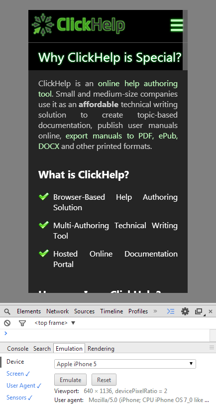
Chrome mobile emulator is probably the best one we have ever seen and that is the one we use for our tests. It has all the features you might need: a predefined set of mobile and tablet devices with screen sizes and user agent strings; the ability to rotate virtual screen and change its size and pixel ratio easily; the ability to emulate a specific CSS media value (can be used to test printable version of your markup too); nice tap cursor emulating finger size to help you check your topics UI for “pixel hunting”, and so on. Here’s how our website looks like on iPhone 5 emulated in Google Chrome 33:
To enable this feature, just go to Developer Tools (Ctrl + Shift + J), click Settings icon at the top right corner and check the “Show ‘Emulation’ view in console drawer” option. This is it. The UI might change, though, so here is a link to the corresponding help topic: Chrome Mobile emulation.
Built-In Browser Features: Firefox
The other browser that is also providing mobile emulation functionality is Mozilla Firefox.
Advantages:
+ Draggable screen borders to check page reaction to multiple screen sizes at once.
+ Easy screenshots generation in one click (the small camera icon in the top right).
+ Support for custom screen sizes.
Disadvantages:
– No device-specific screen resolution or user agent presets.
– Poor built-in support for user agent emulation.
According to W3Shools, Firefox is #2 popular browser nowadays, so we cannot ignore it. Sadly, mobile emulation support in Firefox does not seem to be that cool. Firefox does provide support for screen emulation and screen rotation, but it does not have that fancy predefined list of 40 mobile and tablet devices and besides it does not provide an easy way to emulate a user agent string out of box. However, you can still emulate a mobile device in Firefox, even though you will probably need Chrome (or another source) to lookup specific screen sizes and user agent strings. The emulator has a set of 7 predefined popular screen resolutions, but they are not associated with specific devices.
Screen emulation is called “Responsive Design View” in Firefox and it can be invoked via the “Tools | Web Developer | Responsive Design View” menu item (or via the Ctrl + Shift + M shortcut). Here’s a help topic link in case something changes: Responsive Design View.
As for user agent emulation, there is a hacky way to do this out of the box, but we strongly recommend that you use an extension instead. For example, you can use User Agent Switcher. This extension has a predefined set of user agent strings, plus you can add your own values, so it is quite easy to use.
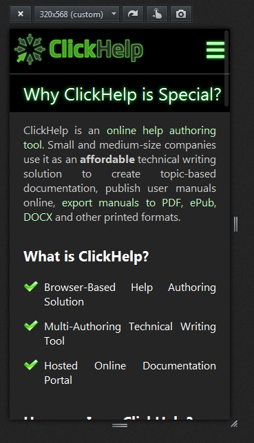
Here is how the same page of our web site looks like in iPhone 5 emulated by Firefox (both with screen size and user agent emulation enabled):
Large Screens Emulation: Screenfly
In addition to browsers, there are specialized tools that provide screen emulation functionality, and some of them are free. We will talk about Screenfly.
Advantages:
+ Presets for TV, Notebook, Netbook and Desktop resolutions.
+ Support for custom screen sizes.
+ Nice rulers to check approximate element sizes.
Disadvantages:
– Cannot test local HTML files.
– No user-agent emulation.
– A few mobile and tablet presets (as compared to Chrome).
An attentive reader would note that we were talking about widescreen monitors at the beginning of the article but have covered only mobile devices by now. Well, now it’s time for widescreen monitors.
If you are not lucky enough to have one at your disposal, you can always emulate a wide screen in Screenfly. Of course, you can also do this with the other tools mentioned above, but the advantage of Screenfly is that it has presets for popular TV, Notebook, Netbook and Desktop resolutions as well as presets for some tablet and mobile devices (even though the number of presets is not as high as it is in Chrome). Just like the other tools, it does not limit your ability to interact with a web page via the virtual screen. However, it has a limitation which is worth mentioning: Screenfly can only show pages published on the web. In other words, you cannot check your local HTML files with it. So, if your help topics are not published online, you are out of luck with this tool.
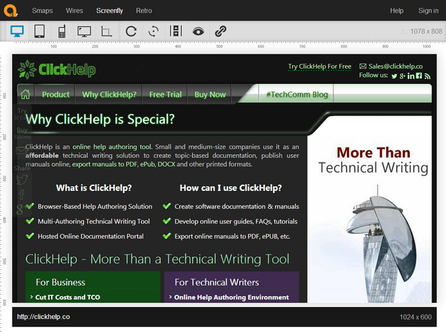
Here is what the same page of our web site looks like on a 10” Netbook (1024×600) emulated by Screenfly:
Conclusion
Finding the right tools and checking what your help topics look like on different devices is just the first step on your way to creating responsive UI. However, there is nothing to be afraid of here – getting a list of device-specific UI issues is about half of the way. Fixing the issues is another half and we are going to show you how this can be achieved in the future parts of this post series.
Don’t want to miss the next post? Subscribe to our Blog RSS!
Happy Technical Writing!
ClickHelp Team


