Fonts are means of transmitting information. You know that you’ve picked the right ones when not the fonts grab readers’ attention, but the message.
Further in this post, we will take a look at common mistakes in font usage and give you practical advice how to pick fonts for different kinds of narratives and combine them.
Common Sense in Typography
Fonts come in different shapes as they serve different purposes. For example, there’s a vast font category – decorative fonts – that is here to get readers’ attention:

Of course, decorative fonts cannot be used in long- and even medium-sized texts. So, the first typography rule we would like to mentioned is define the text purpose. Once this is done, make sure you are not using any fonts that would be in contradiction with the purpose.
To figure out what suits you best – do some research. If you are not sure about font families you should choose, examine what big corporations have to say on this topic.

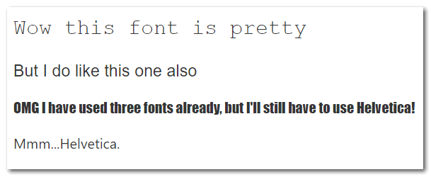
Quite often, titles and a text body have different fonts applied (we will talk about combining fonts for these elements further in this article), you should be really careful with the number of fonts you are willing to use. Remember, a good practice is not using more than three fonts on a single page.
We are off to a good start with these basic typography guidelines. Keep reading to learn more.
Serif Or No Serif?
This seems to be one of the fundamental questions and debate topics. But, seriously, what should one choose? Is there truly a difference?
Well, this controversy is decades old. Let’s try to dig a bit deeper and see what both sides have to offer.
Historically, serif fonts were of choice for newspapers, books and other printables because the serifs are believed to be kind of guidelines for our eyes to follow the text along so we can read faster.

But, it’s not the right time to jump to conclusions just yet. As technologies developed, and most text is read from screen now, sans-serif fonts started gaining popularity. Sans-serifs fit the screens better because they lack additional elements, and such simple shapes are still readable even with low screen resolutions and small font sizes. It is actually the mobile Internet that made them so popular, due to the fact that phone and tablet screens are just smaller.
Also, sans-serif is better for emphasis.The simplicity of shapes makes the letters easier to recognize. So, it can be used in warnings, calls to action, etc. If you take a look around, you’ll notice that close to a hundred per cent real life warning signs use sans-serif.

Overall, sans-serif fonts seem to be in a superior position as we come across them all over the web and UIs, and this fact alone makes them more readable as our brains have got used to them by now.
Still, this doesn’t mean that you need to cross out serif fonts, of course.
This controversy has been never ending exactly because there’s no universal answer. All arguments aside, here’s some practical advice.
Serif or sans-serif tips:
- Try to avoid using serif fonts for text written in small font sizes or meant to be read on small screens.
- Give warnings, calls to action and other important pieces of information that should be emphasized preferably in sans-serif.
Title/Body Font Choice Dilemma
Title fonts and body fonts, how to tackle this right?
First, if you are not a typography genius and visioner – keep it simple and play it safe. You don’t need to be Einstein to understand that Oswald/Comic Sans is a terrifying idea. And, you do not even have to know that there exists a special classification that divides fonts in groups by font moods.
Remember, your goal is to make text readable, not to dazzle everyone with typefaces, well maybe just a little.
Headings are parts of text that have a purpose – to be clear and to stand out. This is achieved through the contrast with the body font. There are multiple ways of doing it.
Here’s what you can use to make titles visible:
- Scaling. Use bigger-sized letters in titles. Also, you can try capital letters or small caps.
- Formatting. Use italic or bold fonts for headings.
- Changing the title color. Be mindful of the fact that too much contrast will certainly harm typography. Before going crazy with magenta shades, consider just making the title font darker than the rest of the text.
- Altering font styles. Try using sans-serif fonts for a text body and serif fonts for a title. Such contrasts usually work great. Vice versa can look awesome, as well.
You can even use the same font, and still get this to look decent by simply making the title font bigger. See how Microsoft used Segoe UI for the <h3> tag and regular text, and it looks pretty:

And, here are things you should always remember when picking fonts for a title and a body.
Title and Body font choice tips:
- If you use multiple heading levels, stick to the “no more than three fonts on one page” rule.
- Do not let titles distract readers. Contrast should be visible but not contradicting.
Combining Fonts
Some fonts combine naturally and look great together, while others simply don’t. But what exactly does the trick?
Let’s start with what we already know – serif and sans-serif fonts can be combined when they fulfil different functions on a page (one being a heading while the other one is used in a text body). You can find this information in almost any article on font usage. But, there are hundreds of popular serifs and sans-serifs, so what kinds of advice is that? 🙂 To combine fonts successfully, you need to study their form. See, each font is comprised of more or less the same elements and their characteristics. Fonts sharing some quality or feature are the ones that fit together best. Qualities that can be shared: height and width of symbols, spacing between them, shapes of letters. And, If you feel like there’s not enough contrast still – use font weights as an additional tool, or go italic!
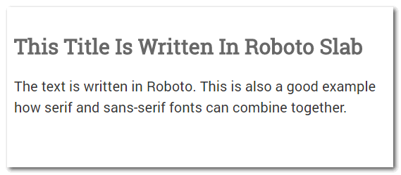
There’s one more way to make the magic happen – study the font background. Try to fit together a couple of fonts from the same designer. There are font families out there created specifically to match each other like Alright Sans and Harriet by Jackson Cavanaugh or Roboto and Roboto Slab by Christian Robertson.
There’s some pitfalls we are willing to warn you about.
Fonts combining pitfalls:
- Do not mix fonts from different time periods. Of course, such fonts can all be called retro, but that doesn’t make them a good match.
- Don’t drive the contrast to the point where it is ridiculous. Sometimes a bold font will work just fine without being an underlined-fuchsia-all-caps-extra-spacing creature.
- Don’t use outdated fonts. There’s a clear difference between retro and lame, remember that 🙂 Ignore almost every font you remember from 10-15 years ago like Papyrus or that font that has turned itself into a joke (*whispering* Comic Sans). BTW, steer clear from Times New Roman, too. It has been so overused that it kind of lost its charm of being a neutral all-purpose font.
- With all this typography happening, don’t forget that fonts are just means of achieving your goal – transmitting information. So, don’t lose readability. No form over function.
Summary: 5 Ultimate Tips For Choosing Fonts
When you are creating online content (blogs, software documentation, web sites, etc), use these tips to choose the fonts to use:
-
Establish the purpose of your message.
This will be step one for picking a font always. -
Research and study.
Study fonts’ background, look for matching fonts from the same time period or the same designer, look for similarities in letter shapes such as letter width, letter height, spacing, etc. Learn how big companies with the message purpose similar to yours make their font choices. -
Use both serifs and sans-serifs, just differentiate their usage.
Remember that more simple sans-serif shapes look good even on the smallest screens and are easier recognized and processed by our brain. Combine these two groups no doubt. -
Use contrast to separate titles from text.
This way you’ll make the titles stand out and increase general readability of your text by adding some clear structure. Means of contrast are: font weight, font color, font size, font moods, etc. -
Never use more than 3 fonts on a single page.
Just never.
This article was written based on our own technical writing experience. If you need to create online documentation, you may also like ClickHelp – the best online documentation tool for web developers.
Don’t want to miss the next post? Subscribe to our Blog RSS!
Good luck with your designs!
ClickHelp Team