
When you need to create user documentation, one thing you start thinking about is how this documentation will look like. Apparently, you can write great content and describe all the features for users. But what about the style, layout, fonts, colors, background, etc.? Even if you think that developing some special design for user manuals is too much, you still can’t just plaintext it. Online documentation has to look nice!
As far as the documentation design is concerned, some ground rules are to be set:
- your help topics must be readable;
- all additional elements (warning boxes, list bullets, tables, etc.) should be informative and definitely not distractive;
- the design should be responsive and look good on mobile devices;
- colors of choice should match,
- etc.
Having a quality user manual can do you a lot of good: gain several authority points from the customers, ease the pressure on your Support team, increase brand awareness through matching corporate design. Besides, quite often, online help is the first place an angry user goes to when they experience some issues, so your task is to make them feel welcome!
Not so long ago, our team faced the task of creating several design templates for online documentation. Going through this process gave us a lot of experience that we are willing to share with you in this blog post. So, here are the six tips for creating an online user manual design.
Target Specific Audience
Before even starting working on your documentation design, you should sit back and think a couple of vital things over, namely – who are you doing the design for?
When you determine specific demands your users might have, you can start making your customers happy.
For example, we created a whole design aiming at a certain part of our target audience – people working with API documentation:
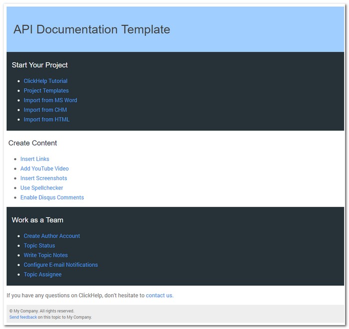
Example – API Documentation Template in ClickHelp
This template was designed to visibly separate code from text with the help of blocks with different backgrounds.The catch behind this kind of design was that we had to think through each element so that they matched the dark and the light backgrounds. We approached this from two sides: we did some elements in two color schemes, and other elements were simply designed to match both backgrounds.
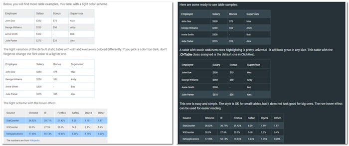
Example – Table Styles for Light and Dark Backgrounds
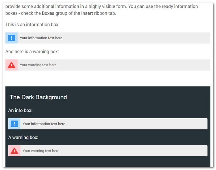
Example – Information and Warning Box Style for Light and Dark Backgrounds
Follow The Trends
Being too unique a snowflake when designing things can get you into trouble. But, I’m not encouraging you to follow in somebody’s footsteps precisely. This is just the matter of what looks edgy and sharp today, and what doesn’t.
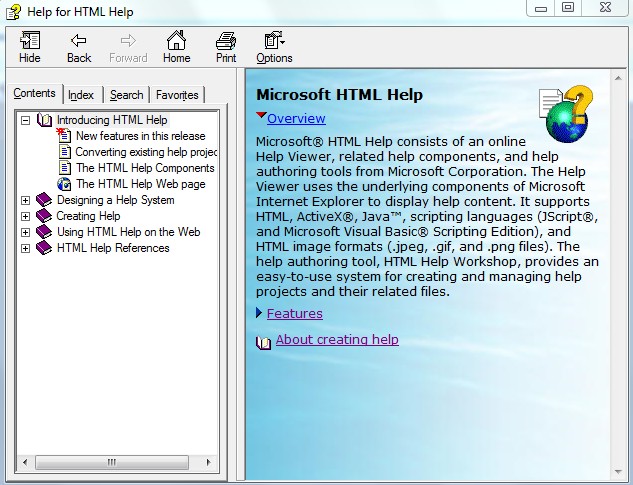
Example – … and what doesn’t
Well, HTML Help Workshop has an excuse – it is no longer developed for a long time. Just make sure your documentation does not look as if your product is no longer developed as well.
The second thing you should do is research. There are always some giant companies that set the trends for many things, and web design is not an exception. The rise of the mobile Internet made all the A-list players turn to simple and clear-cut shapes that would be convenient for their mobile users. So, now, tiles which became popular thanks to Metro design (renamed to “Microsoft design language” later) are trending.
We used tiles in a couple of our documentation designs. For example, our Colorize template looks good on mobile, as well as on big screens with its tiles and matching bright material design colors. Material design is one of modern design trends started by Google and it’s not about colors alone – they have the entire material.google.com domain dedicated to it.
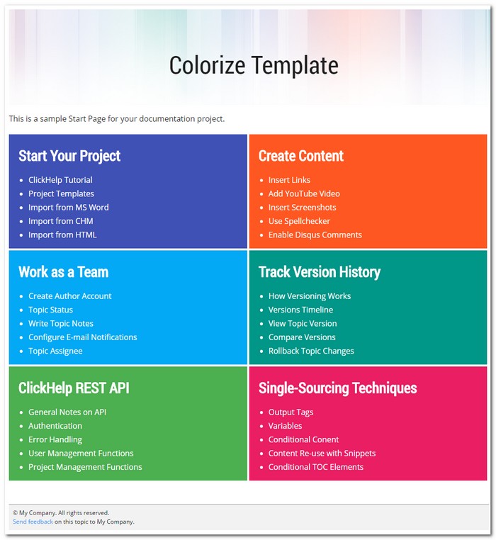
Example – Tiles Layout for Help Topics
Do Not Overcomplicate
Lightweight designs are here to stay. Mobile traffic is still on the rise, so, no heavy, highly-detailed design elements. Some people call this trend Complexion Reduction.
When I knew I had to create a simple and minimalistic design, I thought to myself: well, this is just a perfect task for me, a lazy designer. Gimme 10 minutes, and the new template is here!
Well, nuh-uh.
Turns out, the simpler the shapes are, the fewer colors you use – the more difficult it is to make it look like anything but a Windows-95-is-back disaster. Be thorough – study the form, study how colors match, how far the shadows must go, and whether you need shadows at all.
With that in mind, we worked real hard, re-did things a few times and finally managed to create a minimalistic, functional and good-looking documentation template:
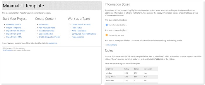
Example – Minimalistic User Guide Template
Responsive Is The New Sexy
You have probably noticed how everyone seems to use high res images and videos on their websites. I’m talking mostly about the landing pages now, the ones that are here to impress you. Why not impress and inspire people with documentation? Or, coming back to Earth, what should one do about a dozen of screenshots on a single page? How long will that take to load them? Be always concerned about the load speed, screen resizing and mobile users.
Responsive design is no picnic. To make this process as painless as possible, try reading this article: Responsive HTML. Part 1 – Screen and Mobile Emulation. If you need to make your content look good on mobile devices and don’t know where to start, the article is for you. You will find a step-by-step tutorial on making your HTML content responsive in there.
We included a pretty large picture as a signature element for one of our templates. The rest of the design was made to blend in smoothly color-wise and style-wise. Check out how the picture behaves when you resize the window.
Example – Responsive Design for Online Manuals
Apparently, the example above is based on the assumption that the image is just a background thing, not a screenshot. You should not hide screenshots even in the mobile view of your online help topics. Instead, the screenshots should resize to fit the screen width and avoid layout issues. When creating user manuals in ClickHelp, this is taken care of automatically by ClickHelp itself – large screenshots will auto-resize to fit the width of the browser window properly.
Awesome Fonts And Where To Find Them
Web design trends are about fonts, as well. The most prominent change that we’ve all noticed recently – sans serif is everywhere. There’s an opinion, however, that serif is not long gone, and it will strike back. Let’s wait and see, and still use sans serif for now 🙂
The ultimate source of all the awesome fonts you saw a million times but never learned their names is, of course, the Google Fonts service. Google’s font collection is impressive, and the service is free.
There is something a fellow web designer once told me – never use fonts that your don’t know. The rule of thumb is to use popular fonts as they are usually popular for a reson: they would not look clumsy and awkward and would be easier to percept in general. Also, people like seeing familiar things – this is not only about brands, this is about fonts as well.
We are using a big deal of popular fonts from Google Fonts in our templates, and we are pretty happy about that. We have also learned a couple of typography tricks from Google in their Style Guide.
Here’s an example of a design we’ve created, perfectly readable and clear:
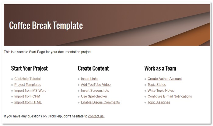
Example – Coffee Break User Manual Template in ClickHelp
Talking about popular fonts… I have to make a comic sans joke now, I apologize for that. Just one tiny old joke.
Comic Sans walks into a bar and the barman says, “We don’t serve your type here”
🙂
The Beauty and the Speed
Responsive design is not a cakewalk, of course. There are though a couple of tricks that can help you create a good-looking fast-loading design and save you some time – patterns!
Instead of having one huge image you can have a tiny one, repeated. We advise you check out free resources like this one – https://www.toptal.com/designers/subtlepatterns/.
If you are not completely satisfied by what’s being offered, you can take a pattern and modify it in accordance to your needs. The awesome subtle space banner at the top of the page is made from a pattern.
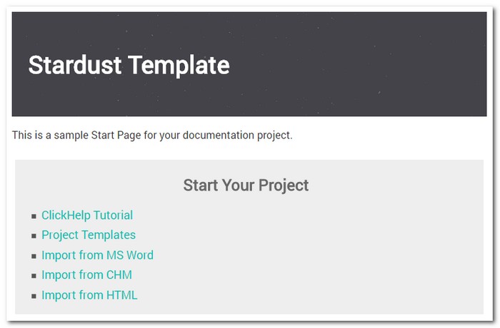
Example – Using Patterns for Backgrounds
Online Help Design Tips
When you need to create online documentation template for your user manuals, our tips would be:
- Target specific audience
- Follow the trends
- Do not overcomplicate
- Ensure responsiveness
- Choose the right fonts
- Balance between beauty and the speed
We hope that our tips will help you create a perfect online help design. And, remember – you are better than Times New Roman!
Did you like the templates from this post? Do you want to use them for your next documentation project? Just request a free trial of ClickHelp, our online documentation tool – it has those templates available.
Don’t want to miss the next post? Subscribe to our Blog RSS!
Good luck with your documentation projects!
ClickHelp Team

