Great news for technical writers and documentation developers – our online documentation tool has got even better and nicer! Totally responsive reader UI, automatic translation support, absolutely beautiful portal and documentation templates, improved WebHelp format and much more!
In this post, we will tell about some of the improvements of our online documentation platform. Keep reading to learn more on:
- Responsive Documentation UI
- Redesigned Documentation Templates
- Improved WYSIWYG Editor
- Redesigned WebHelp Output
- Automatic Translation Support
- Built-In SSO for Google, Salesforce, Azure
Responsive Documentation UI
The responsive web design is a modern approach to web sites implementation. Instead of detecting the mobile device model and delivering different content for different screens (old school), modern web developers implement adaptive web pages. Such pages look different on different screen sizes thanks to CSS3 and media selectors, while the server delivers the same exact content. This approach makes the user experience much better.
ClickHelp is now using the modern response design approach! The user documentation UI changes its layout depending on the screen size to make sure the content always looks good. You can check how this works by checking our own documentation portal: ClickHelp Documentation Portal
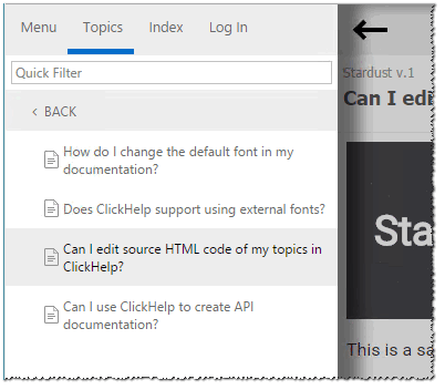
On small screens, the navigation panel with the Table of Contents (and optionally Index) jumps in the so-called “hamburger menu”. This frees enough space for your content to be easily readable on small screens.
Another important change is solving the “fat fingers” problem. This is the effect when your finger is big enough to cover several UI elements at one touch. To solve this, web designers make the UI elements bigger and add more space between them. Now the Table of Contents and other navigation elements in ClickHelp are designed in a way that makes it easier to interact with them on touch-screen devices.
On top of that, as you can see, the Table of Contents panel now uses the word-wrap mode to avoid horizontal scrolling, making the navigation usability even better for your online documentation readers.
With the June 2016 update of ClickHelp, you give your readers a better responsive UI without any extra efforts!
Redesigned Documentation Templates
This our favorite part! We are sure the online documentation must be beautiful, so we have tasked our designers with re-doing all portal and project templates. This was a big project with a lot coffee consumed and several whiteboards broken. But the result was worthy – we’ve got new awesome templates to deliver.
Your documentation portal is the information hub for your clients. When they get to the Home page, it must be easy to understand what’s inside and how they can find a solution. Welcome the new Home page templates that will help you assist your clients even better.
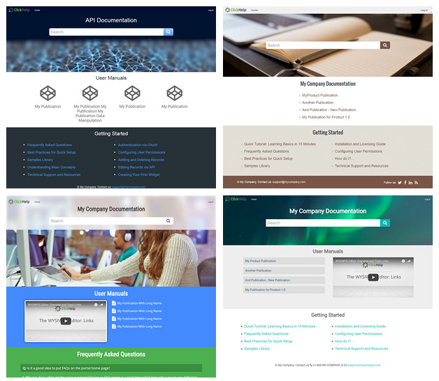
Along with the Home page templates, we deliver the re-designed project templates. Every template has a unique style for the main documentation elements – headings, links, tables, information and warning boxes, FAQ entries, etc.
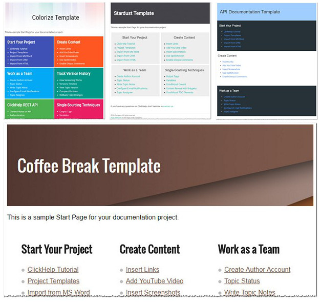
All documentation templates are 100% responsive and look good on any device!
Improved WYSIWYG Editor
Based on our clients feedback, we implemented a number of improvements for the topic editor. Let’s look closer at some of them.
The elements of the topic editor header have been rearranged to provide better user experience on wide screens. The majority of action buttons have been moved to the left side of the header panel, so their position does not depend on the screen proportions. This may be unusual at first, when you just start using the new UI, but you will soon realize that this layout is more convenient and natural, it improves your productivity.

As you can see on the screenshot above, the Workflow information is now a part of the topic header. Previously, it was located in a special ribbon tab and many users could not find this vital information. By moving the elements to the header, we encourage people to use the workflow fields even in small teams – they make the process more organized. You can now see the Assignee and Status without even switching to the editing mode – this information is easily accessible in the View mode.
We have added the Search & Replace feature for the WYSIWYG mode of the topic editor! We had this feature in the HTML Editor mode, and now you can enjoy this functionality with visual editing as well.
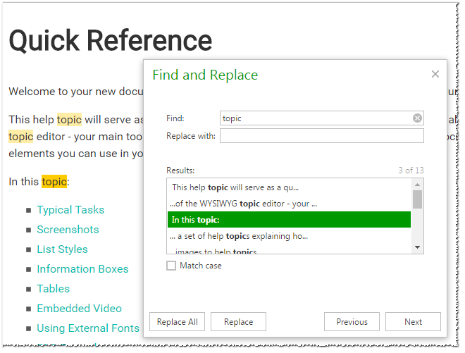
The visual topic editor now provides the Insert HTML command to insert arbitrary HTML code into your topics. You can also use the HTML Editor mode for this operation, as before. The new feature makes it easier to insert HTML chunks in the WYSIWYG mode, which is sometimes easier than switching to HTML.
Good news about the topic header layout – both the author and reader UI now better handle long topic titles by using the word wrap mode. This is especially useful for FAQ articles when the title may contain a pretty long question text, and it is important to see the whole title.

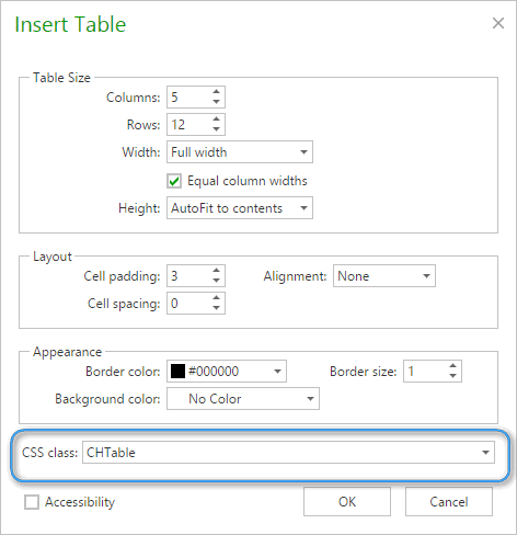
You are certainly using tables in your online help, so you will like this new function. Tables styling is now easier – you can assign a CSS class to a table in the Properties dialog of any Table element. This way, you can easily ensure a uniform style of all tables in your documentation by using pretty simple CSS styles, or even the ready table styles that come with all project templates we provide.
If you are writing long multi-screen topics, you will definitely be happy to learn that now the topic editor preserves the vertical position when you switch to the editing mode and back! This is very useful when you review a long topic in the view mode, notice a typo and need to switch to the editing mode to fix that without losing the scrolling position.
One more nice improvement – a custom topic template. When you create a new topic, it gets some default content. Now you can configure this default content the way you like – just go to “Tools -> Global Settings -> Administration -> Topic Template” and modify the template. Every time you create a new topic in a project, the system will use the template you configured.
Redesigned WebHelp Output
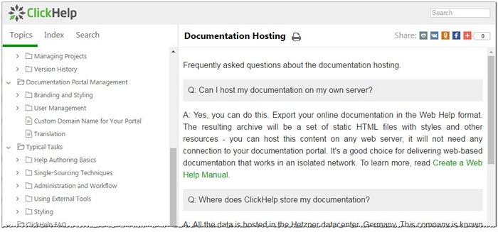
We have re-designed the HTML5 WebHelp output format ClickHelp generates. It now uses a responsive web design approach – works great on any screen size, any mobile device!
The WebHelp output is now more similar to the ClickHelp documentation portal UI and takes into account many of the documentation portal settings:
- We have added the Search box in the top-right corner.
- Table of Contents uses the word wrap mode to better handle long titles.
- The “TOC default state” setting of your portal affects the WebHelp output as well – you can control how many levels of TOC are open by default.
- Images and video elements are automatically resized to fit the screen size.
- WebHelp now handles the “Show topic header on the Articles page” setting of your portal. So, you can now decide if you want to see the topic header panel in WebHelp or not.
- TOC nodes are now collapsed / expanded by mouse click anywhere in the element. It is no longer necessary to hit the expand /collapse button.
- We added the Print button to the topic header.
The WebHelp output now looks more solid and professional.
Automatic Translation Support
Automatic translation is getting better every day. It cannot replace a professional translator yet, but it can provide pretty good assistance to your clients if you don’t have the budget to translate your docs into 100+ languages.
To help our clients with multi-language audience, we have integrated the Google Translate widget into the reader UI. Now you can enable this feature for your portal in “Tools -> Global settings -> Branding -> reader Interface -> Enable automatic translation with Google Translate” and your readers will see the Google Translate widget in the header of the documentation pages.

Built-In SSO for Google, Salesforce, Azure
With this release, ClickHelp adds built-in support for well-known OpenID Connect authentication providers like Google, Salesforce and Microsoft Azure AD.
This means that it is now easier to configure those providers and use them in your documentation website. You can now have many SSO providers configured in one documentation portal, but keep using the standard ClickHelp authentication as an option:
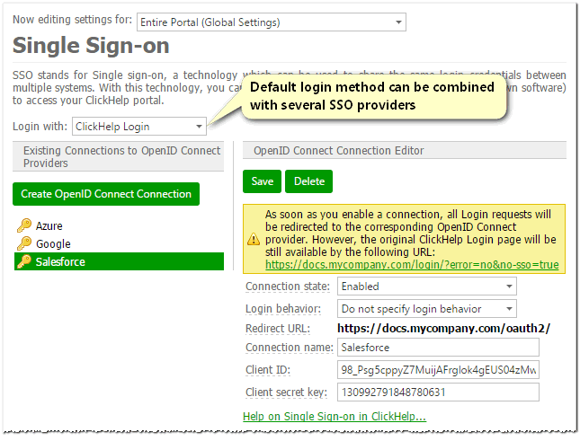
When you do this, the login screen shows the list of available login methods for the readers to choose from.
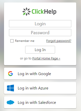
In this way, you give your documentation portal visitors (authors, power readers) a choice – authentication using a ClickHelp account, or using an external SSO provider.
With special support for such providers as Google, Azure AD and Salesforce, the SSO configurqation becomes much easier. To learn more on configuring all those providers for your documentation portal, check our online help:
Single Sign-On
Use Google as SSO Provider
There are many other great improvements in this ClickHelp release – big and small, nice and very nice, some of them are just awesome! Find a complete What’s New document here: https://clickhelp.com/release-notes/2016-june/
Don’t want to miss the next post? Subscribe to our Blog RSS!
Good luck with your documentation projects!
ClickHelp Team


