Page Layout for Printed and Online Documentation
 ClickHelp Teamin Documentation UX on 11/9/2017 — 2 minute read
 ClickHelp Teamin Documentation UX on 11/9/2017 — 2 minute read
Remember, when you studied in college you had to deal with writing different papers? And, if they were not hand written there were all those requirements about the font size, the quotes, the page breaks…’Yuck! But my paper is very much readable the way it is. Do I really have to do this? What a waste of time!’
But, just the moment you got everything right, you started realizing that it was not in vain. Because it just started looking so neat and pro, you couldn’t even believe you were the one to produce it.
Now, since you are reading this, you, most likely, have something to do with technical writing. Which means you are well aware that user documentation is what represents your company along with the product you produce itself. It just has to look good. And, we will try to help you out with that in this very blog post.

Keep reading to find out how to befriend the wild beast – a page layout. Note that this post mostly applies to printed manuals, although, some things mentioned here will work for both – online and offline user guides.
We’ll start with page breaks as some bigger elements and will proceed discussing smaller ones further.
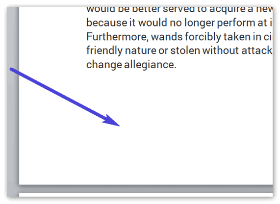
Line breaks mostly apply to printed user manuals. Online technical documentation got it covered.
So, here’s the advice:
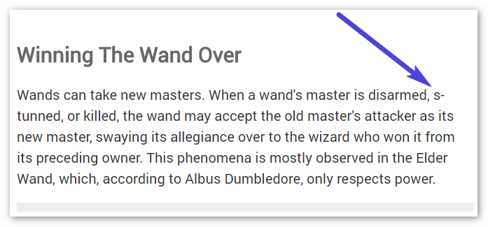
If we go seek advice from such giants as Microsoft on handling line breaks, we may find a lot of interesting stuff, like this:
BTW, we have just recently posted a great article on rules of hyphenating compound adjectives in user guides, check it out by all means.
Screenshots can be found in most user guides. How should we treat them right from the point of view of a page layout?
You might wanna do some reading here on TechComm Zen: Balance of Text and Screenshots in User Manuals beforehand.
The advice on placing screenshots:
We also have some great material on how to take screenshots right.
Feel free to check out this article which is actually kind of a short research with a lot of visual examples.
Okay, we’ve set the ground rules here for you how you can make your printed and online user manuals look good and professional. Hopefully, you will follow them and be satisfied with the results.
Good Luck with your technical writing!
ClickHelp Team
Online Documentation & Technical Writing Tools
Get monthly digest on technical writing, UX and web design, overviews of useful free resources and much more.
"*" indicates required fields