Last time, we talked about screen emulation tools to help you test your web content on different devices. In this post, we will make the next step and take a look at the tools helping you detect any UI issues specific to mobile device browsers.
Note: Although we consider responsive markup in the context of online documentation, this blog post also applies to general web pages and web sites. Even if you are not a technical writer, you may find this information useful.
CSS and Mobile Browsers
The idea behind responsive CSS styles is quite simple: you create different styles for different device types and/or screen sizes. However, devil is in the details. Can you adapt your content for all possible screens automatically? Where do you start? What elements should be hidden / displayed or changed depending on the screen resolution? How can you change the layout of your help topics? What screen resolutions you should handle?
So many good questions… Let’s discuss them one by one.
Can you Handle All Possible Screens Automatically?

No. There is no magic bullet, no big red button, no magic spell for this. Come on, you did not think this was that easy, right? You need to plan your HTML design according to the screen sizes you are going to support. We are here to help you with this!
Where to Start?
Now, when we know the answer to the most important question, here are some points to help you get the idea of the next steps:
- Choose a screen emulator which will show you what your pages look like on different screens. It should allow you to switch from a mobile phone to a 1920×1080 widescreen monitor emulation easily. Our choice is Google Chrome emulation – see Part 1 of this post series for details.
- Check your existing content on different virtual screens to build a list of layout problems. If you still cannot forget the magic button above, we have good news for you: there are some tools which can detect mobile-specific issues with your content automatically, they covered further in this post. For example, they can detect large images which are no good for mobile phones with low bandwidth or some elements or CSS properties which are not supported by mobile browsers properly. They can even detect elements which are too small and/or located too dense to be tapped with a finger properly.
-
Choose your preferred approach to CSS design.
There are two main approaches: Graceful Degradation when default styles are for big screens, and there are special styles for smaller screens; and Progressive Enhancement where things happen vice versa. There is a nice article regarding pros and cons of both approaches: Mobile First Design: Why It’s Great and Why It Sucks, so we will not discuss them here. However, if you already have some content, we bet you originally designed it for a desktop screen, so you should consider using the Graceful Degradation approach most probably. - Plan changes to your page layouts considering specific device types and screen widths you are going to handle. You may need to be very creative trying to push all the page elements into a small mobile screen.
- Get familiar with responsive CSS styles. There are a number of resources on the Internet on this subject. We will also talk about this in our future blog posts.
- Create your responsive styles. Yep, this is the most tricky part, and we will touch this topic in future posts as well.
Free Tools for Mobile CSS Issues Detection
It is always a good idea to run automatic validations on your pages as you work on them to notice the issues timely before it is too late. In this section, we will cover a few free tools from popular vendors which can help you with that.
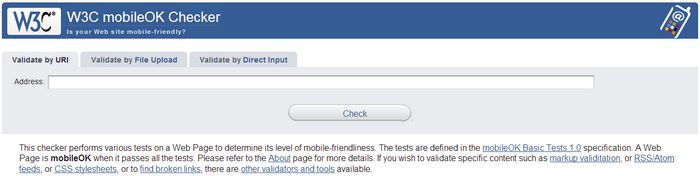
This tool provides comprehensive report on all content associated with the given page – markup, styles, images. It checks for various standards compliance, validates against a number of heuristic rules to check for things which are known to cause issues on mobile devices and so on. The main validation targets are page performance (this includes content size and the number of requests) and things which might not be supported by specific mobile devices and therefore might be displayed incorrectly.
Unfortunately, W3C moibleOK Checker does not emulate a mobile device when requesting your page and therefore if you have the same URLs for mobile and desktop pages (like we do), you can end up checking the desktop version of your content against mobile-specific rules. As a result, W3C moibleOK Checker may give poor ratings for your website even if it has a mobile version.
The name of the tool may cause confusion, but this tool does check both mobile and desktop versions of your pages via proper mobile emulation.
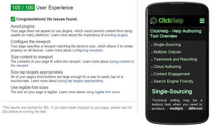
This is the tool of our choice – not because we have been flattered by its output, but because it emulates mobile devices and focuses on clear stuff affecting real user experience, like tap target sizes and density, font readability, content sizing (to fit viewport) and so on.
Just like W3C mobileOk Checker, PageSpeed Insights provides specific numbers which show you how much room you have left for improvement and how important (approximately) these or those changes are for user experience (at least, in Google opinion). However, in case of PageSpeed Insights, the numbers are closer to real life – for example, the tool gives you an estimation of how much traffic you can save if you optimize your images or minify your styles and scripts. This is an important advantage which allows you to decide whether the optimization is worth the efforts.
The last, but not the least note on Google PageSpeed Insights is that its primary purpose is to check the performance of your content – both for mobile and desktop users. And page speed is known to be an important SEO factor for Google and your page visitors who leave after 3 seconds of page loading. Thus, it is worthwhile to spend a few minutes to check your content performance results and automatic improvement suggestions provided by Google PageSpeed Insights. We are not going to cover performance here in detail, but if you are interested in it, check this resource on page speed optimization. Also, take a look at our blog post on lazy-loaded images – this can help you decrease the content size and improve the performance dramatically for pages with a lot of screenshots.
Summary
Now you know how to emulate mobile devices and how to detect various mobile-specific issues automatically. However, not everything can be automated. There are still layout issues which can only be detected by a human, and it is often unclear how to resolve them. But don’t worry – in the next part of this post series we’re going to discuss some typical mobile-specific issues, and give recommendations on how to resolve them.
Don’t want to miss the next post? Subscribe to our ClickHelp Blog RSS!
Happy Technical Writing!
ClickHelp Team