Responsive HTML Tutorial. Part 3 – Problems and Solutions
 ClickHelp Teamin HTML & CSS tips on 6/4/2014 — 5 minute read
 ClickHelp Teamin HTML & CSS tips on 6/4/2014 — 5 minute read
This article continues our post series on creating responsive online documentation. The first part considered free screen and mobile emulation tools – a “must read” for technical writers who care about mobile look of their content. Then we talked about automatically detecting mobile-specific issues in online documentation. It is time to get to solving mobile experience problems related to the content layout, and this post will give you practical advice.
Note: Although we consider responsive markup in the context of online documentation, this blog post also applies to general web pages and web sites. Even if you are not a technical writer, you may find this information useful.
The tools we mentioned in the previous post are able to detect a lot of issues automatically. However, they still don’t cover 100% of situations specific to wide screens or mobile screens. We should not blindly try to fit all their rules. As people say on Stack Overflow, not everything that comes from Google is a "holy grail" just because it comes from Google.
This means that you still need to examine your content manually, and we will consider some typical issues you should be looking for. The majority of problems related to the varying screen sizes has the same root cause: the screen width. Let’s take a look at what may go wrong with it.
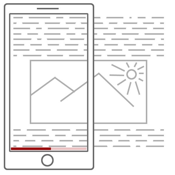
Since people usually read your content horizontally (left to right or vice versa), they are OK with having a vertical scrollbar. Scrolling the content top to bottom as they read line by line is fine. However, the horizontal scrollbar will force them to scroll each line of your text, which definitely is not good user experience.

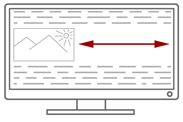
The opposite situation is the empty space in your content due to the wide screen width. A 500px-wide screenshot occupying an entire line may look fine on a 3×4 desktop monitor. But on a widescreen 1920×1080 monitor the screenshot will occupy only 25% of the screen width. The remaining 75% will be empty space, which does not look good.

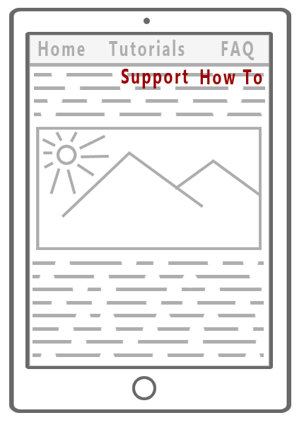
After reading about the two previous issues, some skilled technical writers may think they are safe because they use floating <div> elements. "Hey, my blocks will just jump around to fit the screen width and the layout will be fine." Well, using floating DIVs can help you indeed to a certain extent. However, you are still likely to see some issues if you check how your topics are displayed on a mobile phone or a tablet. For example, if you have a main menu with floating (or inline) elements, how will these elements react to the decreasing screen width? Right, they will jump to the next line. As a result, you will either see menu items leaving their nests and floating over your content, below the header, or you will not see them at all if they appear to be hidden beyond elements with greater z-index values. Responsible menus is an interesting topic and we are going to cover it in a future post.

Now, when you are aware of typical problems, let us examine possible solutions. By following the guidelines below, you will handle the majority of the mobile experience problems in your online documentation. So, let’s get rolling!
Whenever possible, avoid hard-coding element widths. If at least one element in your help topic has a hard-coded width and it is greater than the screen width, you will get a horizontal scrollbar. A very good example of this situation are the screenshots. They are usually rendered as images and they can be wide, causing your help topics to have horizontal scrollbars. One of possible solutions is to set their widths in percentages, not in pixels. For example, for full-width screenshots you can do it like this:
<img src="…" style="width: 100%" />
This may solve a part of the problem. However, this may not look good on wide screens. Consider specifying the max-width and min-width styles as well, if necessary. Remember, if you do not set the image width explicitly, each image element will still have some width assigned to it, and it will be defined in pixels. Here is an example:
<img src="…" style="width: 100%; max-width:600px; min-width: 200px" />
Filling the empty space (the problem we mentioned above) can appear to be tricky depending on your specific layout. If you are working on a documentation project, you can use our free online documentation templates specially adapted to fit 1920×1080 monitors. They are available as a downloadable package, so you can see how the styles are implemented there and do the same for your online content. Those templates are also built into our cloud documentation tool – ClickHelp.
To understand the idea we used in those templates, here are some guidelines to consider:
Check your UI on different screen widths carefully. If you do face problems with jumping blocks (e.g. in the menus), consider showing / hiding them depending on the screen width. A common example of this approach is responsive menus which either display all their items on wide screens, or move all of them to a popup menu leaving a single small menu button on small screens. We will talk more about implementing this approach in a future post.
Beware of small and dense navigation elements. It may be fine to have a 5×5 pixels icon in your topic header for desktop users. We understand your wish to use small icons in order not to overload the UI, really. But try to hit that icon with your finger when viewing the help topic from a mobile device, especially if there are other navigation elements nearby. You are likely to fail your first 50 attempts, which will drive you mad unless you are good at Zen. Make sure your UI elements are big and sparse enough to be hit with a finger without invoking other elements accidentally. The circle icon emulating the finger size in Google Chrome mobile emulator can help you with this type of testing.
If you have some popup menus or other navigation elements which are supposed to be invoked by hover events, make sure they can be invoked by clicks as well. Remember that there are no hover events on mobile phones and tablets. This may be a real issue for some interactive behavior triggered by those events. So, if you care about the mobile experience, pay enough attention to this aspect.
Making your content look great on mobile devices is not a simple task. And it may look scary in the beginning. However, this is still not rocket science – you can figure this out by dealing with every aspect one by one. In this post, we have tried to list the most typical layout problems and give suggestions on how to solve them. If this post was helpful, and you don’t want to miss the next one, subscribe to our ClickHelp Blog RSS.
Happy Technical Writing!
ClickHelp Team
Get monthly digest on technical writing, UX and web design, overviews of useful free resources and much more.
"*" indicates required fields