Documentation branding – a lot of people are doing it, but few know why it is such a necessity. In this post, we will touch upon the main goals of documentation branding and also equip you with the right tool to style your docs in an efficient manner.

Why Branding Your Technical Documentation is Good
Branding Turns Docs into a Marketing Tool
Online documentation portals incorporate many aspects that lead us straight to marketing. Modern technical writing indeed is a marketing tool. In such an innovative and cloud-based solution like ClickHelp, a lot of options are available to improve your company’s position on the market with the help of docs.
It starts with such simple things as meta descriptions for help topics, continues with the relevant keywords your documentation provides with links to your website, and all of this is crowned by branding.
Adding a logo, using corporate colors, styling every topic in accordance with your main website… All this plays out nicely in terms of higher visibility for the brand.
User Manuals Look Pro with Less Effort
When you are using a style guide developed by experienced designers and approved in your company, you can’t go wrong with it. Colors will match and compliment each other, typography will be clear and readable, user manuals will look professional and crisp.
You won’t need to reinvent anything or allocate extra resources to specifically design an online documentation portal.
It all comes down to setting up all the branding just once with the guidelines you already have at your disposal. Your clients will definitely feel the effort behind the doc portal – a good looking branded portal tells its readers a story about a team of professionals with high levels of expertise who came together and made it happen.
Users are More Loyal
User experience stretches far beyond a product UI or how well some service works. It intertwines with all aspects of clients interacting with your company and builds a general impression.
Branding equals being consistent with your message. This definitely plants the idea of something solid and trustworthy inside the minds of your clients.
Branding in ClickHelp: Real Examples
It is time to check out a real life example. Let’s see what Funancial, one of our clients, did with their ClickHelp documentation portal, what branding options they chose to use and why.
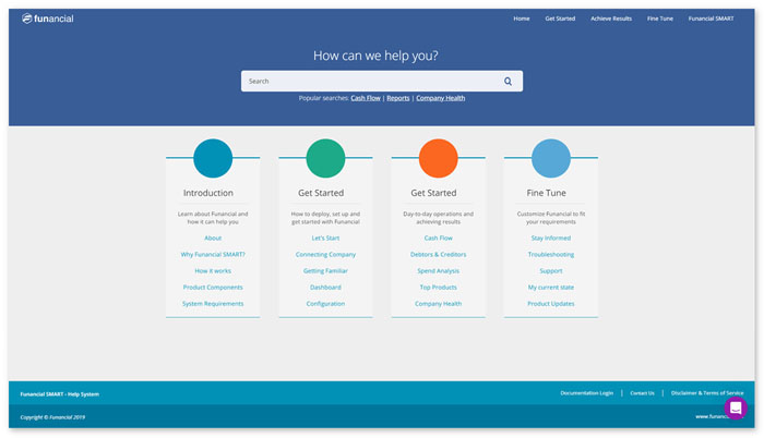
Here’s the homepage of the Funancial online doc portal:

The top-left corner contains their brand logo – an immediate indicator of the company that owns these user manuals – it can be added to your ClickHelp portal with a simple drag-and-drop action. Also, logos can lead to a corporate website.
The layout looks really lightweight and appealing with simple geometry and subdued but still bright colors. This homepage leaves a nice overall impression.
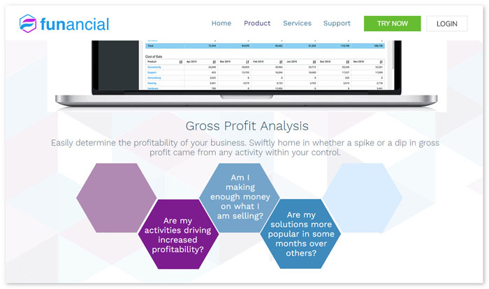
Let’s see how the online portal ties in with the corporate website:

The first thing we notice is a matching logo. Further investigation shows that though Funancial didn’t make their documents portal the exact copy of their website, it has a lot in common: the same dominant shades of blue, minimalistic geometry and general subtleness.
In ClickHelp, you can shape up your portal in any way you want. All of our clients have their own ideas of the perfect documentation and how to brand it, and, ClickHelp allows all their ideas to come true due to its outstanding flexibility.
The portal you just saw explains very well how even not following a website’s design gets you great results.
You can see more examples of real documentation portals powered by ClickHelp at our Portal Gallery. We hope that these designs will inspire you!
Conclusion
Make it a habit to always remind yourself that branding is how you distinguish yourself from the competitors. As technical documentation is an integral part of your company, it is yet another tool you can use to build better UX and establish stronger relationships with customers, and branding can help a lot.
Good luck with your technical writing!
ClickHelp Team
Author, host and deliver documentation across platforms and devices
