We strongly believe that technical documentation should be available for everyone regardless of their health condition. That is why we have decided to create a series on technical documentation inclusivity.
This article will explain the challenges colorblind people face when reading user manuals and ways to improve technical documentation to make it more accessible to them. The first part of this series is available in our blog by this link – Technical Documentation for People with Dyslexia.
What Color is This?
Not all people know what color blindness is. What most people know for sure is that the colorblind can’t tell red from green, and this may cause problems when driving. In reality, it is much more complicated than this, although the red-green color deficiency is one of the most common forms of color blindness.
There are cone-shaped cells in the retina of the eye that contain color-detecting molecules. The three kinds of cones are responsible for detecting red, blue and green colors. Defects in these cones can lead to different types of color blindness. There are rare cases when people don’t see color at all. Physical damage to eyes can cause color vision deficiency, as well.
How widespread is this condition? According to National Eye Institute, 8% of men and 0.5% of women are color blind as far as the Northern Europe ancestry is concerned. This is a lot of people, and they are constantly experiencing difficulties in various areas of their lives, including reading user manuals.
Let’s see what we can do to make technical documentation more colorblind-friendly.
User Manuals for Color Blind

As we stated earlier, colorblind people can face certain difficulties with technical documentation connected with their vision deficiency. Here’s what technical writers can do to improve this situation:
- The combination of red and green should be avoided as it affects the majority of colorblind people.
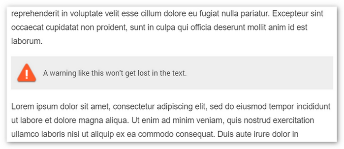
- To create a warning message in a text, use additional elements like boxes and/or icons. If you just use red font color, for many color blind people such a warning will blend in with the surrounding text and won’t be visible.
- Avoid depicturing metrics relying solely on color difference. Take a look at the image below. The left part of the image depicts the actual image, and, the right part represents how a lot of colorblind people would see it:
- Create contrast. When you are placing colors next to each other, make sure you are placing the light ones next to the dark ones. This way you can even use the red and green combination (if this is unavoidable), or any other combination safely as the colorblind are able to tell light and dark shades.
- If your corporate design relies heavily on what you believe can be hard for colorblind people to distinguish, you can create a special version of your user manuals for the color vision deficiency. This sounds like a big task, but it isn’t. For example, in such online help authoring tools like ClickHelp, you can use single-sourcing techniques and create multiple outputs of the same user manual easily. What you basically would need to do in this case is to add a style file that would change styles in your documentation to colorblind-friendly ones. And, you can also use conditional blocks to store imagery, and it will be later added automatically only to the version for the colorblind.


Even though in most cases colors are not totally absent for colorblind people, they are subdued. And, this makes it harder to interpret such graphs. You can try adding texture to graphs to fix this:

Conclusion
These easy tips can make a huge difference for color blind people. We hope to raise awareness among technical writers with this post series and increase technical writing inclusivity as we believe that, still, a lot needs to be done here.
Good luck with your technical writing!
ClickHelp Team
Author, host and deliver documentation across platforms and devices


