Document design can be regarded as one of the efficiency factors of your documentation. Some may say that this factor is minor compared to the relevance of your content for the readers. Practice shows that no matter how important or useful your content might be, it is the design that makes a reader stay on the page and keep reading.
This blog will help you understand what modern document design is and how to improve your documentation in terms of design.
What Is a Document Design?
Let’s start with the statement that design is for the readers. So, try and look at your documents with your readers’ eyes and analyze design from the point of UX. In this regard, document design has two aspects: visual aspect and documentation architecture.
Visual aspect. From the readers’ standpoint, design is, first of all, how your documents look. Such things as fonts, color schemes, and image quality are important as they make the text visually attractive. Visual attraction means balance and harmony. It is the esthetic quality of the text, the thing that makes it inviting o the eye.
Another function is that visual design elements eliminate the monotony that users feel when reading lengthy and complicated manuals. This is important, as it helps to keep the reader on your page.
Besides, when applied throughout all your documents, the visual elements form the unique style of your documentation. Style makes documentation look universal and recognizable. It is good for marketing purposes, as the style will be associated with your company.
Architecture. This is a general notion that means how your documentation is organized and how users (readers, writers, reviewers) can interact with it. The basic principles here are single sourcing, content reuse, and related capacities, such as different outputs and versions of the same content.
Elements of Document Design
Now let’s have a look at design elements in detail. The easiest way to design your documentation is to use ready-made templates and styles.
Templates and Styles make your documentation consistent. All your technical writers, reviewers, and translators will use the same page design, layouts, color schemes, etc. Using pre-designed templates and styles will save you a great deal of time. You won’t have to think about such details as headings, headers, footers, fonts, backgrounds, etc.
However, sometimes you have to make things more individual. This happens when your company has a style guide, and style regulations must be strictly followed. For example, the corporate color palette may be different from that in the template.
You can customize the design of your documentation in ClickHelp with Branding CSS.
Another thing that you have to think about is fonts. In the templates available on your ClickHelp portal, conventional fonts are used. Fonts familiar to the users guarantee that the readability of your documents will increase, as legible fonts make users stay on the page longer.
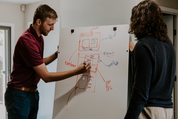
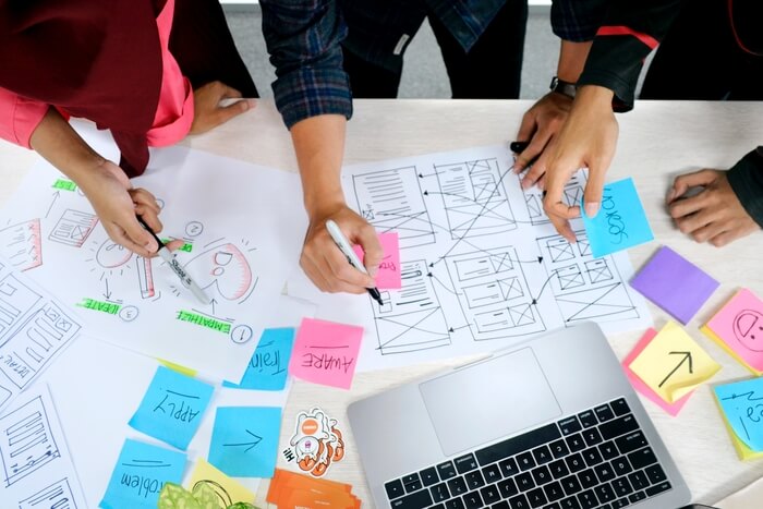
Visuals are a factor that makes your document design more attractive. They help to avoid the monotony of a lengthy technical text that some readers cannot stand and press the cross in the upper right-hand corner of the page. They give your eyes some rest and keep you interested. Below are a few examples of visuals you can illustrate your documents with.
- Photos ensure that your docs look true to life. Without them, the text looks abstract and remote from reality.
- Drawings are what readers want when they need a simplified layout view. The advantage of drawings over photos is that they weigh less, and they are handier when you need a printable version.
- Graphs are great for presenting data in a concise form. They are the best way to illustrate trends, changes, and correlations.
With any visual element, you should employ the principle of proximity and make sure it is placed where it is mentioned in the text so that the reader doesn’t have to work to find it.
Portal Home Page can be considered a separate design element. If your document portal is stored in a cloud, a reader will access it online, and the first place they will visit will be the portal home page. The home page can be regarded as a landing page from where readers can navigate further to any document they need.
In ClickHelp, you can choose templates for your home page with very clear layouts.
Page layout is an essential part of the design. This is the key to successful navigation and enhanced UX.
A table of contents is a structural design element that reflects the architecture of your document. If you have a porta in ClickHelp, you can choose TOC items from the portal gallery. But, of course, there is always an opportunity for customization. You can add, delete, and rename elements and modify the TOC (table of contents) as you like.
As was said above, document design cannot be limited to the visual part. When designing documentation, consider the parameters related to the way users interact with the documentation.
Output types of your documentation mean that you may need different ‘modifications’ for the mobile and web versions, for a smartphone and a PC, etc. ClickHelp allows users to publish projects in a variety of outputs (including web, printable, and mobile content).
Different versions of the same content are another design element that refers to the general architecture of your documentation. You will have to come across the notion of single-sourcing when publishing similar versions of the same content. In ClickHelp, you can modify your content, making elements included or excluded. This can be achieved by using variables, tags, or snippets.

The Principles of Document Design
The modern document design practice is based on several principles. As long as documentation is stored in digital form online and often contains large amounts of information, it should be designed so that readers can navigate and search it easily.
- Easy navigation is achieved in different ways. Readers can navigate the necessary content from the landing page (homepage). Each document should contain a table of contents so that all chapters and subchapters are visible and readers can switch between the necessary sections of the document.
In ClickHelp, TOCs are provided for all documents. They can be found on the left part of the screen. TOCs can be applied from samples or customized. - Searchability is another design element that should be mentioned here. Search is what makes the user experience either positive or negative. If a search gives no or wrong results, the user will most likely turn to some other source of information.
To make your content searchable, you can add index keywords. For example, if you add an index keyword ‘dragonfly’ to a document titled ‘The diversity of dragonflies in Texas,’ the search performance will be increased.
Using synonyms can also be helpful when it comes to improving searchability. For example, if your content concerns ‘CAT tools for smartphones,’ you can use ‘translation tools’ or ‘computer-aided translation’ to make your language more diverse. The searchability of your content will grow as people use different words and collocations when they look for the necessary information. - Readability is the third component to mention in the context of document design. Readability is how quickly and easily you can read a text and perceive information. This parameter is usually measured by readability indexes, such as the fog index, Coleman-Liau index, etc. In ClickHelp, lots of readability metrics are available.
- Localization-focused design. Localization can be costly for your company’s budget, so the main idea here is to subcontract to the localizer; the less content, the better. Under these conditions, your documentation should be designed in modules so that you can send to the localizer only the files you have changed instead of the whole set of content you have.
Benefits of Document Design for Your Business
Document design can improve the overall appearance of your documentation. It will look more consistent and unified. As a result, your content will look official. This will add extra points to your product.
Another advantage is that good design makes your content recognizable. In this respect, design can be compared to marketing. Good design can position your product on the market.
The marketability of your product will grow as more customers will turn to your documents for information. This is a matter of comparison and choice. After trying several information sources, people will vote for the one which is organized (designed) better.
Different layouts or outputs (for desktop and mobile versions, for instance) will make your product more versatile. As a result, you will increase the target market’s coverage and attract more loyal customers.
Localization features that are gradually becoming available in documentation management tools will help you facilitate the process of making your product international. For example, in ClickHelp, you can localize your content on your own portal using your in-house human resources. This will save you a certain amount of finances otherwise spent on outsourcing.
And remember that the document design cannot be reduced to content and information. It is about communication, after all. Good design can establish good communication between you and your customers. Through design, you can visualize your intentions: show respect to the reader, make your message visually attractive, show what you want the reader to focus on, and show that you care!

Conclusion
A well-designed help site can save users a lot of time and effort. They will thank you for comprehensible, searchable, and navigable content. By investing time and money in design, you help your target customers understand the benefits of your product. And as soon as they understand that your product is better than that of your competitors, they will become loyal to your company and stay with you for a long time.
Good luck with your technical writing!
ClickHelp Team
Author, host and deliver documentation across platforms and devices


