Are your user manuals good or bad? Let’s run them through our quick checklist. Don’t get discouraged if it turns out to be not perfect, this article contains a lot of ideas to follow that can change your software documentation for the better!
Data Completeness and Accuracy
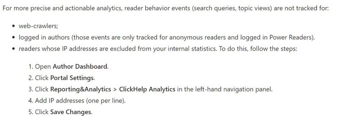
Bad user manuals make customers feel frustrated and leave more questions than answers. Customers try following the instructions, but it doesn’t give positive results. Incomplete user documentation misleads users, giving them a wrong idea of how to use a product or tool. It ruins the user experience. Poorly written instructions cannot guide users properly.
Here is the example of an incomplete user manual:

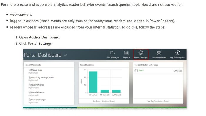
Good examples of technical writing provide customers with complete information. They don’t have to look for additional sources of information to figure out how to use this or that tool or product. The information is always accurate and precise. It leaves no ambiguity, and following the instructions will surely lead to the expected results.
Here is the example of a complete user manual:

Document Titles
Bad instruction manuals have uninformative and misleading titles. Users have to guess what the title is telling them. They have to look through the text, trying to figure out what information they will find in the section below. They cannot navigate as they don’t understand where they are.
Here is the example of a poorly written title:

Good technical documentation contains clear and informative titles. They help users navigate and understand what kind of information this or that section contains. Titles should never be ambiguous or mislead users.
Here is the example of an informative title:

Lists
In bad user manuals, lists of steps for instructions are not-ordered. Simple bulleted lists are used instead. This is very inconvenient to follow such a list when you are trying to use some instruction. Poorly written technical documents are always messy.
Here is the example of a poorly written list:

Good user manual always feature ordered lists of instructions. It works great for readers and support engineers as this makes it so much easier to refer to steps when they are numbered. Here’s an article on using lists correctly in technical documents that will help you avoid many common mistakes.
Here is the example of an informative list:

Screenshots and Images
Bad technical documentation has few or next to no images in it. First, this just looks lazy. Second, it makes understanding harder for readers.
Another way to ruin a help topic is to add screenshots/images without proper text descriptions – these are very annoying to decipher.
Here is the example of an uninformative user manual:

Good documentation has plenty of images. Any screenshot is always followed by some description. Also, two screenshots never appear next to each other without an individual capture.
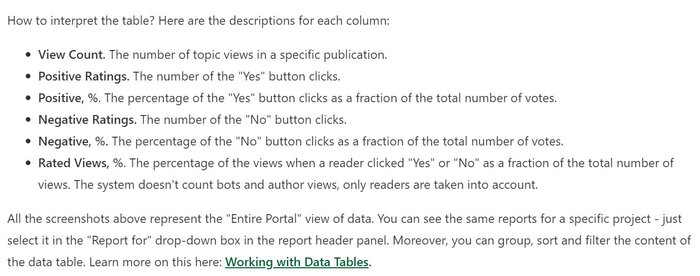
It is a good practice to keep in mind the image size (when we are talking about online documentation). Ideally, your images should be of decent quality, but quite light at the same time. Heavy images lead to slow page load and high traffic consumption.
Here is the example of an informative user manual:

Delivery Speed

Bad documentation takes a lot of time to be delivered. This can happen due to many factors including the absence of a help authoring tool. Online documentation tools make content creation swift and easy.
Good technical documentation is reusable and takes less time and effort to be created. Taking advantage of a HAT’s functionality can be a game changer. Technical writing tools help to organize teamwork, reuse content with single-sourcing techniques, create context help, write help topics faster with powerful WYSIWYG editors.
Consistency
Bad user manuals look and feel inconsistent. This happens because often many technical writers can be working on the same project and this can lead to diversity in texts. Like, different terms can be used to describe similar processes, page layouts can look entirely different, etc.
Good documentation teams have a style guide and a documentation plan. These two are used by all team members, and they ensure there are no noticeable differences in style throughout the whole documentation project.
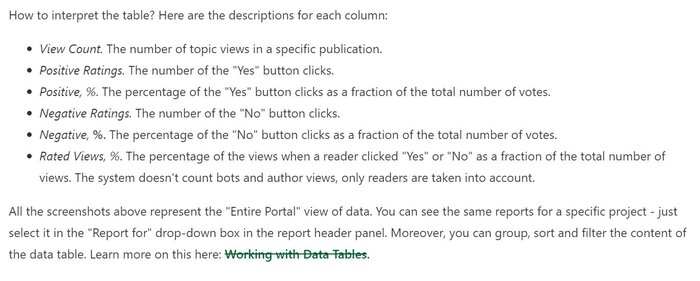
For example, a company may use the following style in technical documentation:

Then the style below would be inconsistent:

Readability Score

Bad user manuals are hard to read. You really need to put some effort to understand all the terms and break down long complex sentences. Terms are not explained, text contains just a few links/references.
Good user manuals are checked with readability score tools. This means that the content runs through different tests and it gets a readability score based on various algorithms (word length, sentence length, frequency of word usage, quantity of terms in a text). If the score is not satisfactory, user manuals are re-written. Grammar is highly important for high-quality technical writing. Read or post – Tricky Grammar in User Guides to learn more.
Conclusion
There are many differences between good and bad technical documentation. Often, the devil is in the details and smaller things like poor font choice or too many abbreviations and neologisms or even bad screenshot quality (we are not only talking about their resolution here) can put people off. Sometimes, documentation templates become a great solution to create high-quality user manuals. Feel free to share your ideas on the topic in the comment section below – what bad technical documentation is like for you and what documentation mistakes ruin the positive user experience?
Good luck with your technical writing!
ClickHelp Team
Author, host and deliver documentation across platforms and devices

